- Understanding the Significance of Color Cohesion
- Establishing the Foundation: Crafting Your Color Palette
- Creating Harmony with a Color Corrector
- Maximizing Visual Appeal: Enhancing Image Quality
- Achieving Visual Balance: Adjusting Exposure and Contrast with Ease
- Setting the Right Mood: Balancing Saturation for Visual Impact
- Creating Visual Harmony: Harmonizing Colors for a Unified Feed
- Strategies for Visual Consistency: Elevating Your Instagram Feed
- Unlocking the Full Potential of Your Photos: A Guide to a Color Corrector
- Conclusion
Key Takeaways
- Creating a color palette is necessary as it makes your profile look more professional.
- Software like Capcut can help with color correction with its advanced tool in just a few clicks.
- You can choose a warm color palette for tropical or natural destinations or a cold color palette for urban areas.
“To Color or Not to Color: Traveling Through Instagram’s Cinematic Palette.” (Shakespearean Flair)
While traveling to your favorite destination or on a vacation, photos, and videos play a key role. They are the best option for keeping your memories alive and revisiting them after a while. Taking this point into consideration, there are a lot of websites on the internet like free online video editors and photo editors.
Platforms like Capcut are a great alternative to enhance the quality of your media. Being a companion, add an extra element of beauty and elegance by making it vibrant. When it comes to the picture quality, it very much depends on the camera and the lens you are using. Luckily, with advanced software and technologies, you can edit them to a certain level so that they can become much more captivating and beautiful than before.
Even if you love to share photos and videos online on platforms like Instagram, Capcut can be very useful for you. You can create a color cohesion on your feed to add a similar vibe to a series of posts. Color cohesion refers to creating a similar visual theme that is followed through some posts consecutively. This makes your profile look more beautiful and elegant.
Understanding the Significance of Color Cohesion
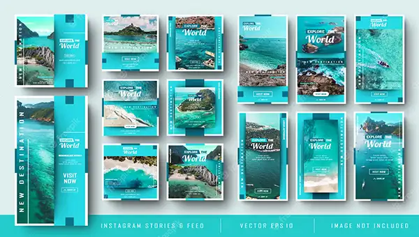
You must have heard the saying “First impression is the last impression”. This saying goes accurately with your Instagram feed. Whenever someone interacts with your profile, judge your personality according to that. Plus, there is nothing wrong with growing your Instagram page with a lot of followers. Moreover, it reflects your style and travel interests.
Establishing the Foundation: Crafting Your Color Palette
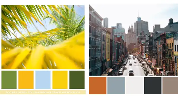
As mentioned before, crafting a color palette through your Instagram posts can help in creating your own style and presenting your vacation, the way you want. It not only makes it look more beautiful but also shows passion and consistency towards your travel and reflects how professional you are.
You can choose a palette based on the destinations you are traveling. Warm color palette if you want to share photos of some tropical or a destination close to nature like Spain, Bali, Vietnam, etc. You can also choose a cold color palette for urban destinations like New York, London, Paris, etc.
Creating Harmony with a Color Corrector
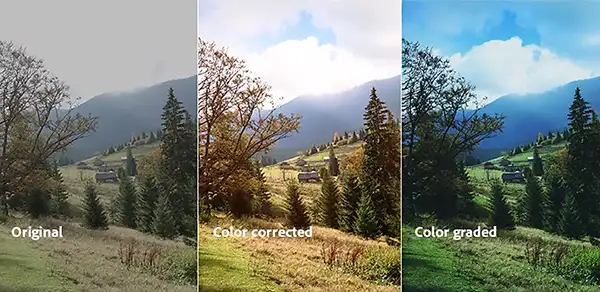
When your actual footage comes out, it seems pretty dull and boring. To get over this issue, the software comes with an option for color correction that can play with the hues, shadows, edges, corners, and pretty much everything to make it more captivating.
Maximizing Visual Appeal: Enhancing Image Quality
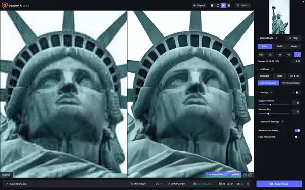
Why adjust with those blurry or low-quality photos? You can enhance the sharpness and clarity of your media with the help of various free editing software online. You can upscale the quality to a higher resolution and can digitally involve the punch to them that was missing earlier.
Achieving Visual Balance: Adjusting Exposure and Contrast with Ease
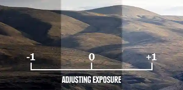
It does not matter how expensive equipment or camera and setup you are carrying with you. If you can’t play with the exposure right, your images will always miss their real crisp. Especially if you are going to upload those media on your Instagram profile, it becomes even more necessary to keep adjusting their exposure to the best.
Setting the Right Mood: Balancing Saturation for Visual Impact

These two photos are completely poles apart when it comes to their saturation. By altering saturation, you can enhance the color and mood of the image. By adjusting saturation, you can also play with the mood of the image and can express it to its peak.
Creating Visual Harmony: Harmonizing Colors for a Unified Feed

Color correction never lets you down. You can balance any photos and their colors to fit in your post library. You just need to make sure that they are all related to the same color palette.
If you master the skill, you can certainly make your feed much more attractive and captivating.
Strategies for Visual Consistency: Elevating Your Instagram Feed

Editing is not the only thing that you have to master. You have to consider all aspects and implement them on your feed. There are some strategies that can help you in creating your feed beautifully.
- Plan your grid: As mentioned, you have to plan the grid or some consecutive posts at the same time so that you can create cohesiveness.
- Choose a color palette: You can choose a color palette according to the location in which you are posting the photos.
- The use of templates and presets: While in the process of color correction, you can decide on various color templates and presets in which you find your images best.
- Using captions: You can also add some captions or texts to the images or videos to express emotions or explain some themes or events.
These are some strategies that can help you in making your feed exceptionally well.
Unlocking the Full Potential of Your Photos: A Guide to a Color Corrector
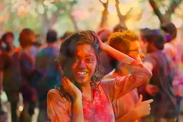
Though it is pretty easy to use color correction tools, still, here are some points that you should consider before using:
Access the Color Corrector Tool
Go to your web browser and access Capcut’s color correction tool.
Upload Your Image
Once you enter the website, click on the Color Correction Tool’s button. Upload the image that you want to look more beautiful.
Allow the Tool to Work Its Magic
Once you upload the image, the intelligent tools will start working to give you the best output possible.
Adjust the Intensity
Once the color correction process is completed, you can adjust the intensity of the editing. If you feel the image is getting overwhelming and looks weird, you can lower the intensity level, or vice versa.
Save the Enhanced Image
When you are finally satisfied with the changes and corrections made, you can just hit the save button and download the edited image.
This is a brief guide that will help you create an elegant set of images for your Instagram feed.
Conclusion
Color correction is a great option to express thoughts and feelings more efficiently through photos. Also, it can help to create cohesiveness among a series of images, which can make your Instagram feed look more professional and give it an elegant touch.


