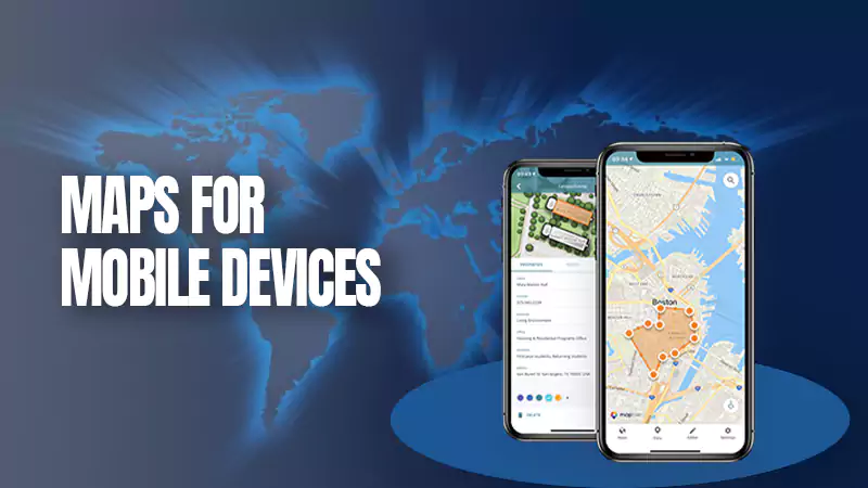
Having a map navigating users to your store is a pro, yet bad UX practices will waste your effort. Successful map building is not just about data but also data styling. According to Nick Babich from Adobe, a good map design balances design and data.
Therefore, companies providing mobile application development services should go beyond the mere map functionality and invest significantly in the flawless user experience path.
In this article, we’ll discuss building user-friendly maps to bypass customer frustration with unfriendly interface and functionality flaws.
Let’s get started!
When building maps into their websites and mobile apps, business owners often skip important considerations regarding map usability and thus come across common issues. Here are some of them:
Issue 1: Panning and Scrolling
Using a map is not a problem when working on a PC, yet scrolling maps on a mobile phone may be a challenge due to spacial restrictions. The screen is smaller, as well as the space for manipulation.
Since map elements are harder to see, a user needs more scrolling, panning, and zooming to get the required information. This adds an extra layer of functionality to map building.
Solution: besides making an app attractive and clear graphically, a design team should consider such factors as animation and gamification to make fiddling with the map visually and functionally appealing. Although this influences the app development cost, the final result is worth trying.
To learn more about the app development cost, check the article: https://mlsdev.com/blog/app-development-cost.
Issue 2: Touchscreen Responsiveness and Network Delays
There are circumstances when designer team efforts cannot influence the map’s usability, for example, when the network connection is slow and a user cannot manipulate a map effectively.
Consider the following scenario: a user tries to zoom in on a specific location but gets no result due to a network delay. A user redoubles efforts and receives a double result as well: the size of the zoomed object is too big. This causes a lot of frustration since a person should zoom out again to see the location finally.
Solution: to avoid such a scenario, designers should consider adding functionality that will save user efforts, like enabling a list view of locations. Then a person can select the location needed, which will be zoomed automatically – much more accessible than manual zooming in slow network conditions.
Issue 3: Combining Toolbar Functionality with a Map
Toolbars are necessary, yet often, when interacting with a map, a user can accidentally activate the toolbar and needs extra manipulations to close and minimize the unneeded windows.
Solution: ideally, the toolbar should be spaced out from the map so that a user doesn’t activate it accidentally. Also, the menu items should be simplified functionally and reduced visually to not distract a user from a map.
Issue 4: Enabling Help and Escape Functionality
Imagine you enable your map with super helpful functionality, but your users need to guess about it. Or, a user gets stuck in the middle of a session, needing to learn how to manipulate a specific object. These and other issues are natural blockers to flawless user experiences.
Solution: always give users a hint on their next step. Enable notifications on when to scroll, zoom or tap to make people feel more confident when using your app for the first time. The first impression is lasting, and making the first session flawless can guarantee users will get back to your app.
Key takeaways
Implementing maps following the best UX/UI practices may be a game changer to the functionality of your app. If a map is necessary for your app’s concept, keeping it user-friendly and flawless will win customer affection and drive profits.


